El Niu · Llar de Criança
The space is for the children. The decision belongs to their parents.
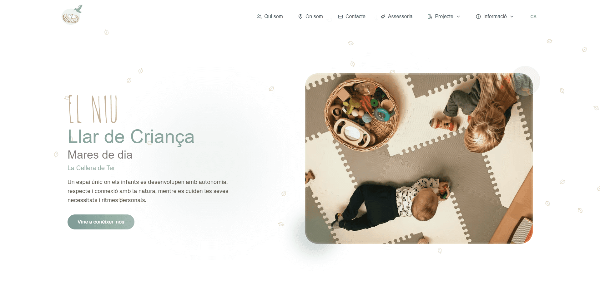
Visual direction, structure and website for a llar de criança — a small early years centre — in La Cellera de Ter: a space for children that had to earn the trust of the adults choosing it.
- Visual direction
- Structure and message
- Web design
- Development
- Client
- El Niu — Llar de Criança
- Work
- Brand website
- Location
- La Cellera de Ter, Girona
- For
- Mothers and fathers looking for a place to trust with their children
Where it started
A brief made of feelings, not pixels.
El Niu didn't ask for a fixed structure or a list of pages. They told us about their approach, what couldn't be left out, how they understand early childhood and the colours they identify with. Our job was to turn those ideas into a coherent digital experience.
How they approach childhood
- Respectful education
- Accompaniment
- Each child's own rhythm
- Autonomy
Their references
- Montessori
- Pikler
Their network
- Part of XELL
What it had to convey
- Nature
- Calm
- Care
- Closeness
- Trust
Greens, earth tones and the landscape around La Cellera as the starting point.
The challenge
Made for children, without being childish.
The website is about a space for children, but the people who visit it, compare, read about the approach and decide are mothers and fathers. We had to find the right point between the two.
Too childish
Primary colours, cartoons and toy-like fonts. Charming at first glance, but less credible to someone deciding where to leave their child.
El Niu
Warmth, real photography, a calm pace and clear information for an adult comparing options without hurry.
Too corporate
Tidy, correct and cold. It feels serious, but it no longer feels like El Niu.
How we solved it
Real photos, not illustrations
The space, the materials and everyday life as they are. What a family wants to see before visiting.
Colours from nature
Soft greens and earth tones instead of primary colours: friendly for a child, calm for an adult.
Small details, not decoration
Barely visible leaves as texture and rounded shapes. Enough warmth without turning the website into a storybook.
Copy written for parents
A close, respectful tone, written for the adult making the decision, without diminutives or clichés.
Digital identity
A website that feels like the way they educate.
We started from their hand-drawn logo and their colours to build the website's visual direction: light, white space and photographs given room to breathe.
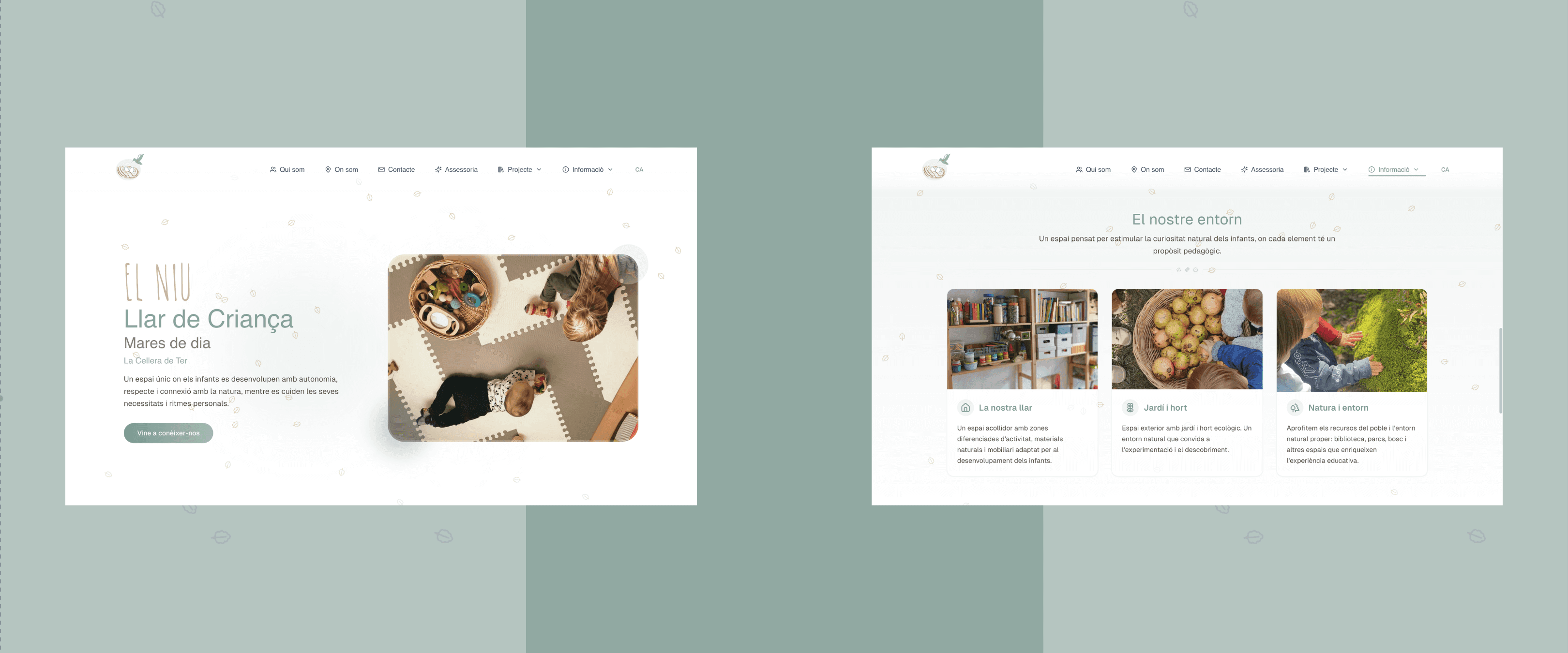

- ◦The hand-drawn logo, paired with a clean, readable typeface
- ◦Scattered leaves as an almost invisible background texture
- ◦Photos with rounded corners and plenty of space around them
- ◦Soft buttons and shapes in sage green
- ◦Sections that read without hurry, one idea at a time
We developed the website's visual direction from the identity El Niu already had. It wasn't a rebrand.
Content and structure
An educational approach you can understand without reading a manual.
The information existed, but it was scattered. We organised it around the questions a family asks, so every answer has its place and can be read in a few minutes.
What a family wants to know → where they find it
Who are you?
Qui som
Who is behind El Niu and what kind of space they've created.
How will you look after my child?
Projecte
The educational project — respectful education, with Montessori and Pikler as references — and the fact that El Niu is part of XELL, explained in a friendly way, without turning it into theory.
What is the space like?
El nostre entorn
The centre, the garden and the vegetable patch, with the village's natural surroundings as part of the experience.
Where are you?
On som
The location in La Cellera de Ter, clear and easy to find.
How do I get in touch?
Contacte
A form and direct WhatsApp, one step away from any page.
From the start, the website was prepared so Google understands what El Niu is, what it offers and where it is — without turning it into a page written for search engines.
From interest to conversation
From “I like what I see” to “I want to talk to them”.
Nobody makes a decision like this through a cold form. The website had to shorten the distance between discovering El Niu and talking directly to the two people who run it.
- 01
Discovers El Niu
↓→ - 02
Understands the project
↓→ - 03
Gets answers
↓→ - 04
Form or WhatsApp
↓→ - 05
Talks to them directly
Form
For those who prefer to write calmly and explain their situation.
Direct WhatsApp
A direct link to message each of the two people in charge of the centre.
Assessoria
An additional advisory service, with its own section on the website.
Mobile
Made to be read on a phone, too.
Many families discover and revisit a centre on their phone, often in short moments. The journey, the reading and the contact options were designed to feel natural there too.
- ✓Copy that reads comfortably on a small screen
- ✓Photos that stay calm on mobile too
- ✓Form and WhatsApp always within reach
The process
From brief to a website ready to publish.
From the first conversation to a website ready to publish, the project took four weeks, including revisions.
This is the context of this project, not a standard timeline: every project has its own pace.
- 01Visual direction
- 02Structure and content
- 03Design
- 04Development
- 05Revisions with El Niu
- 06Publishing and preparation for Google
Think of the children without forgetting the parents.
Every visual decision had to feel warm to a child's world and credible to the adult deciding.
Explain the approach without making it heavy.
Short answers to real questions, instead of endless blocks of educational text.
Start from how El Niu already saw itself.
We didn't impose an outside aesthetic: we gave digital form to what they already were.
Your project
Is your business better than your website shows?
Tell us where you are and what you want to achieve. We'll design the solution around the goal, not around a template.
Tell us about your project ↗