Somos Focus Media
A creative agency couldn't have a generic website.
Focus is a strategy, content and social media agency based in Girona. They already had a personality of their own. Our job was to translate it into a website that would also be part of their portfolio.
- Web direction
- Design
- Development
- SEO foundation
- Client
- Somos Focus Media
- Work
- Web direction + Website + SEO foundation
- Area
- Girona · Costa Brava · Barcelona
- Timeline
- About 2 weeks
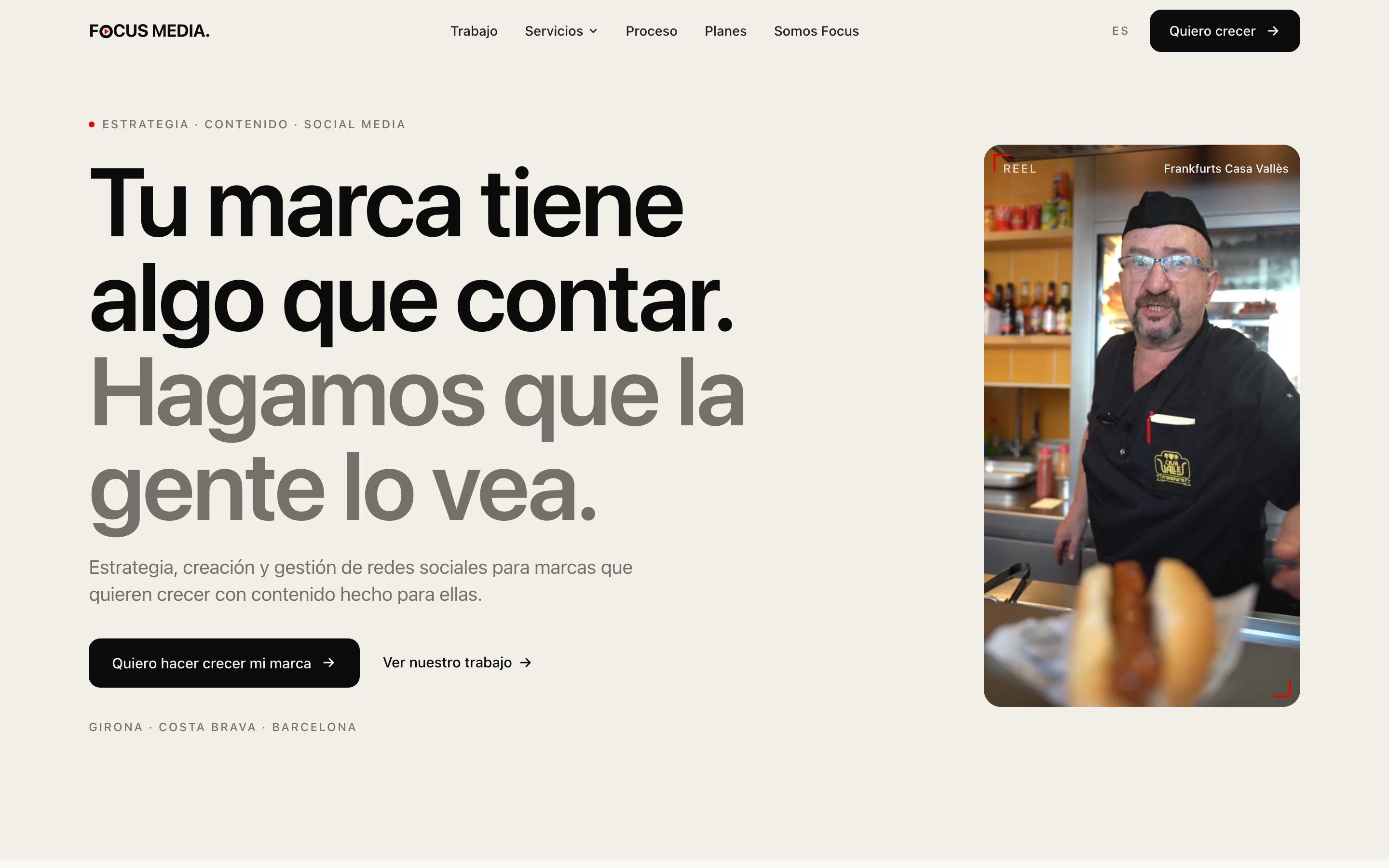
Where it started
The direction began with questions, not a template.
We kicked off with a meeting and a questionnaire. Before designing anything, we wanted to understand how they work, how they talk and what someone should feel when they land on their website.
What they already had
- A clear personality
- Black and red as brand colours
- Two complementary profiles
- Real work to show
What needed solving
- A website that matched the quality of their work
- Services that are easy to understand
- A clear path to get in touch
- A foundation so people can find them
We started from their identity, not from a template.
The balance
Creative, but clear.
A creative agency can fall into two extremes: a website so corporate it says nothing, or so experimental nobody understands what they do. Focus had to sit in between.
Corporate only
Tidy and correct, but it could belong to any agency. It shows no creative judgement.
Focus
Personality and structure: you can tell who they are and understand what they do.
Experimental only
It grabs attention, but the services are hard to follow and it's unclear how to start.
How we solved it
Headlines with their own voice
Short, direct lines in the tone they use to talk about their work.
Their work up front
Video and real client pieces from the very first screen.
A familiar structure
Simple navigation: work, services, process, plans and who they are.
One main action
The same button to start a conversation across the whole website.
Identity
Keep the brand. Extend the system.
Black and red were already theirs. We added white as a third colour for contrast, easier reading and room for the layout to breathe.
- ◦Black for strength and high-contrast blocks
- ◦Red as an accent: details, markers and points of attention
- ◦White for calm reading and breathing room
- ◦A restrained typeface that lets the content lead
- ◦The existing logo, unchanged
We worked on top of their existing identity: this isn't a full branding project.
Services
Services explained, not a catalogue.
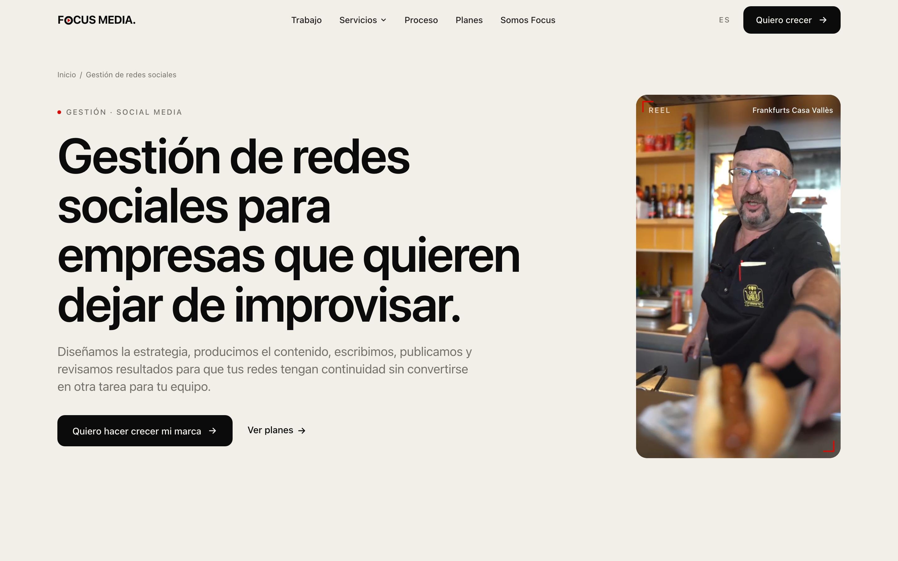
Each service has its own page, following the same logic: what it is, what it solves and how to start.
What they offer
Their real services.
Each with its own page.
- →Social media management
- →Content creation
- →Corporate video and filmmaking
- →Product and brand photography
For whom and where
Specific context.
Pages for their area and their sector.
- →Social media agency in Girona
- →Social media agency in Barcelona
- →Social media for restaurants
- →Plans
Service → what it solves → contact.
SEO foundation
A creative website still needs to be found.
SEO isn't the lead of this project, but the website couldn't stop at visuals. We put the groundwork in from day one.
“Focus Media” is a common name. The website and the profile help build a clearer entity for Google and for anyone searching for them.
- 01Keyword research
- 02Page architecture by service and area
- 03Dedicated service pages
- 04Metadata on every page
- 05Creation and initial optimisation of their Google Business Profile
Contact
From website to conversation.
Anyone landing on Focus should be able to start a conversation without overthinking it. The website offers several ways in, all easy to find.
- 01
See their work
↓→ - 02
Understand the service
↓→ - 03
Get in touch
Form
Name, brand, social profiles and main goal, with a “not sure yet” option.
A direct link with the first message already written.
Email and phone
Direct contact links, always within reach.
The contact page also explains what happens after you get in touch.
Timeline
From brief to a website ready to publish in about two weeks.
Meeting and questionnaire, direction, design, development and revisions. A short process, because the identity and tone were clear from the outset.
The route
- Meeting and questionnaire
- Web direction
- Design and development
- Revisions
- Ready to publish
This is the context of this project, not a standard timeline.
Room to expand
A website that can grow with the agency.
Focus won't need to rebuild its presence every time something changes. The structure takes new pieces at the agency's own pace, with the same visual direction.
- 01New services
- 02New work and case studies
- 03New areas
- 04New content
Start with questions.
The questionnaire and the meeting set the direction before the first design.
Extend the system without changing the brand.
A third colour was enough to gain clarity without losing character.
Clarity is creative too.
A website with personality still has to explain what you do and how to start.
Your project
Is your business better than your website shows?
Tell us where you are and what you want to achieve. We'll design the solution around the goal, not around a template.
Tell us about your project ↗